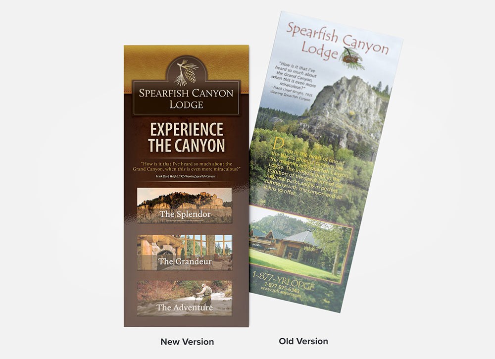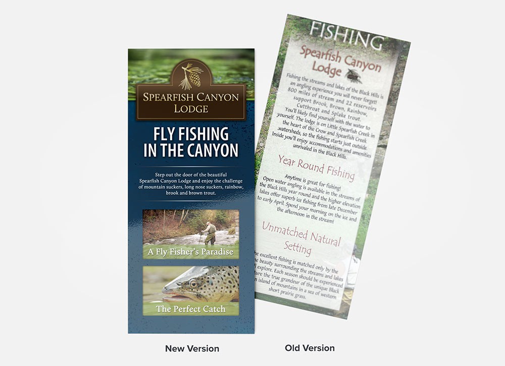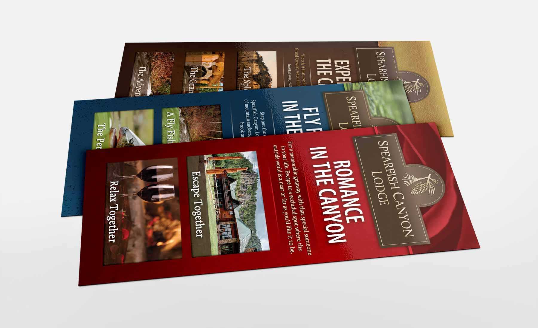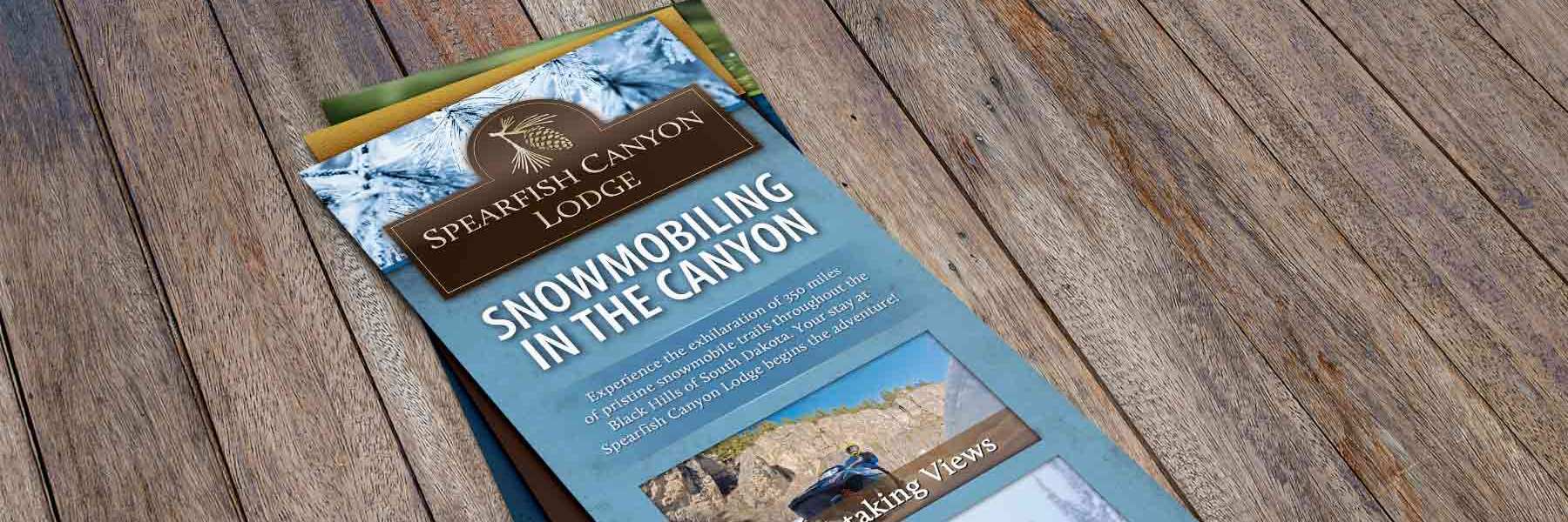
Spearfish Canyon Lodge is a beautiful lodge tucked away in the scenic and peaceful Spearfish Canyon known for their relaxing lodge atmosphere and breathtaking views amidst the towering limestone cliffs of Spearfish Canyon. Their rustic elegance needed to be captured and expressed through all of their marketing channels. We partnered with them to produce a logo, as well as a consistent and cohesive system of rack cards, posters, trade-show banners, email marketing, all of which captures their rustic elegance.

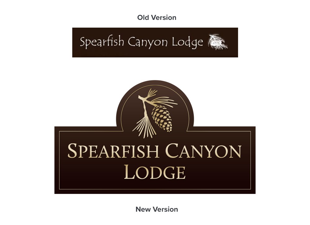
During our Discovery phase, one of the first things we noted was that the previous version of the Spearfish Canyon Lodge logo was too rustic and not at all elegant, and therefore didn't line up with the company's brand. However, a completely new unfamiliar was not the solution. Instead, we decided to upgrade the previous mark, matching it to the company's rustic elegant brand.
After enhancing their logo, we made sure that their rack cards matched the Spearfish Canyon Lodge brand character. We created a simple layout that could be used across several cards while leaving enough design flexibility through colors, textures, and imagery, allowing each card to shine on its own.
