The City of Spearfish was founded in 1876 and is located in the heart of the northern Black Hills region. We may be slightly biased, but we truly believe Spearfish is THE best place to live. Imagine our delight when got the opportunity to develop a new logo for our beloved town. This new visual identity needed to communicate Spearfish’s excellent quality of life, welcoming charm, natural beauty and its traditional roots.


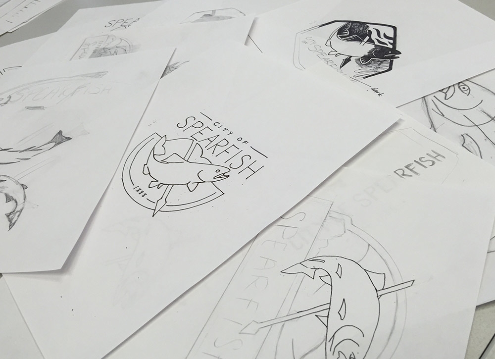
Strategic collaboration with the city's stakeholders and key representatives of the community resulted in a successful concept and development of the final logo that features not only one, but two iconic components that unmistakably proclaim "Spearfish".

The traditional speared rainbow trout and the renowned silhouette of Crow Peak can now be seen on vehicles, signage, documents, promotional materials and have streamlined our city's image and marketing efforts.