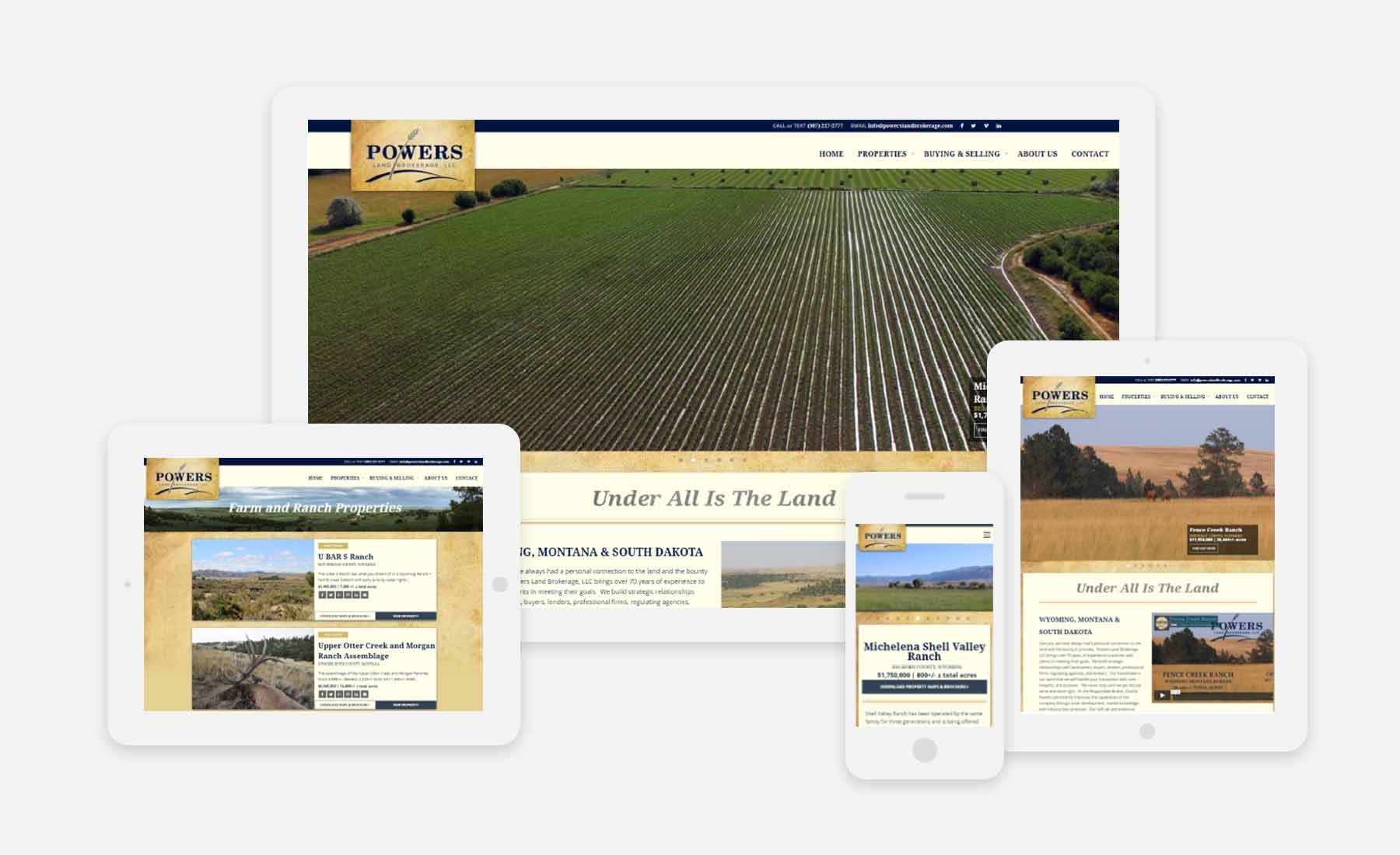
Powers Land Brokerage came to us in need of branding that would be ready to go to work as a critical acquisition tool for the new agency. The development of the Powers Land Brokerage corporate identity features several graphical elements that represent the iconic features of the Western Plains. The rustic, elegant branding is effectively integrated into the real estate website's custom layouts.

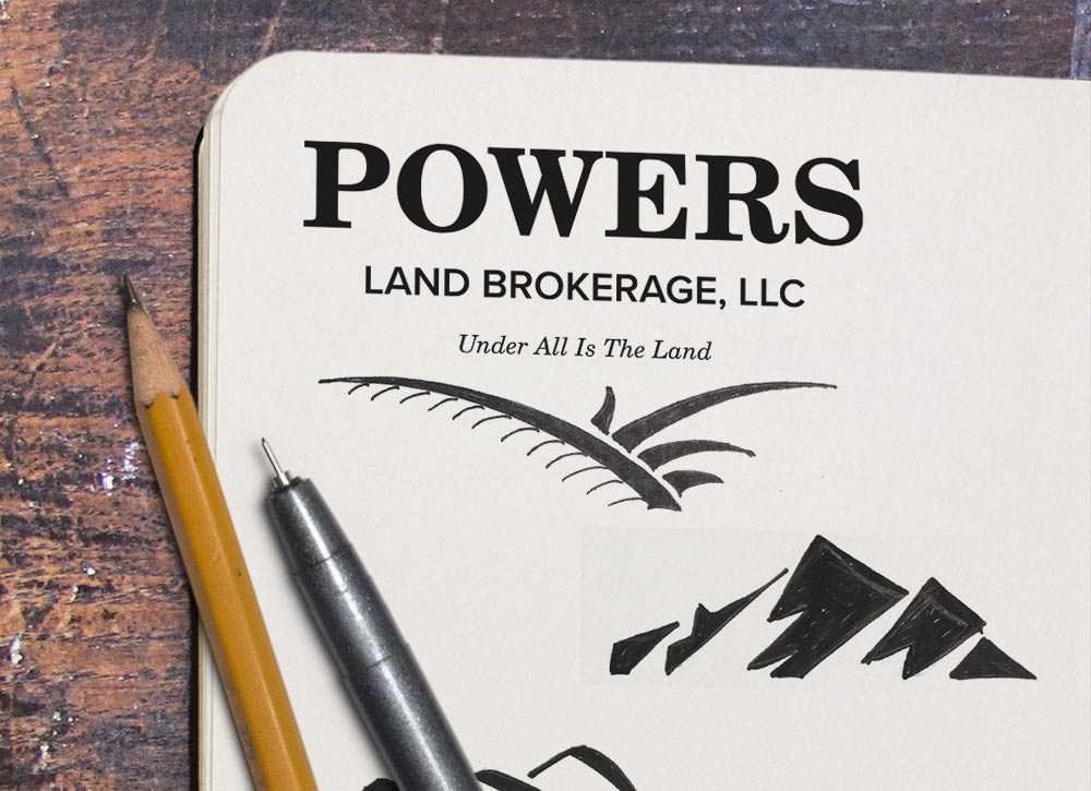
During our Discovery process, we found that the company brand needed to visually convey stability, experience, high-morality, and relationality. Along with that, it was important to the client that the logo included a simple iconic visual of “the west”.
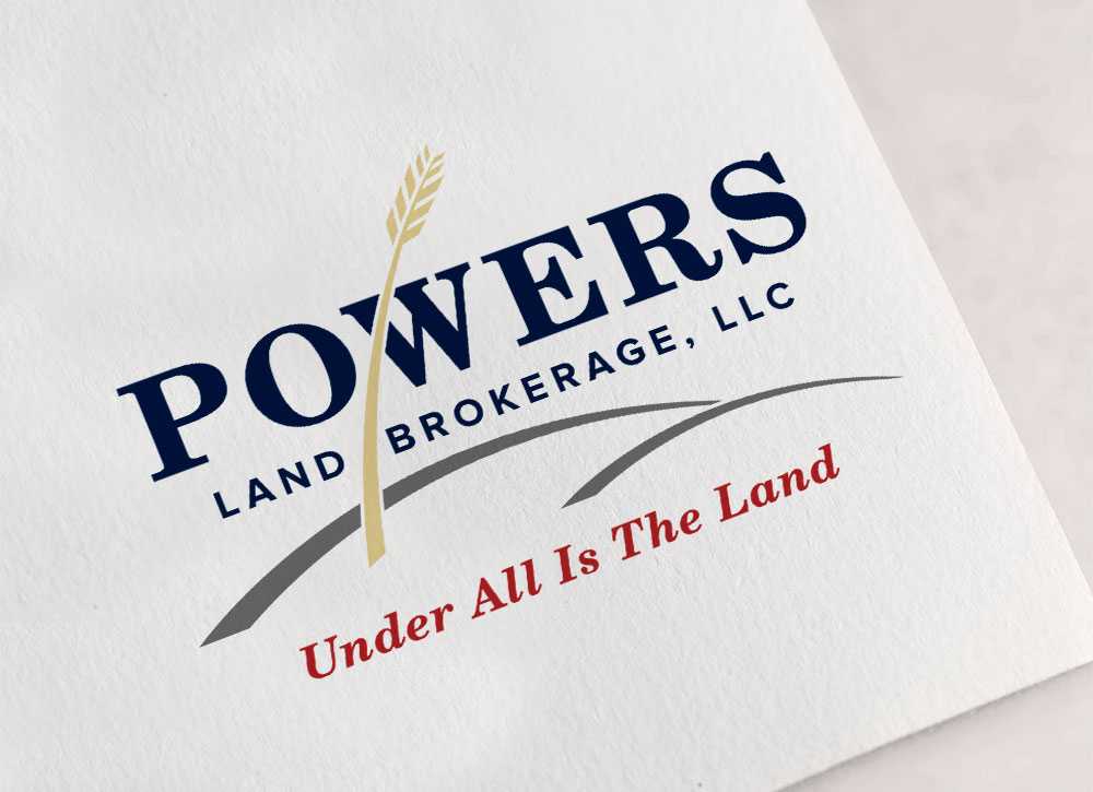
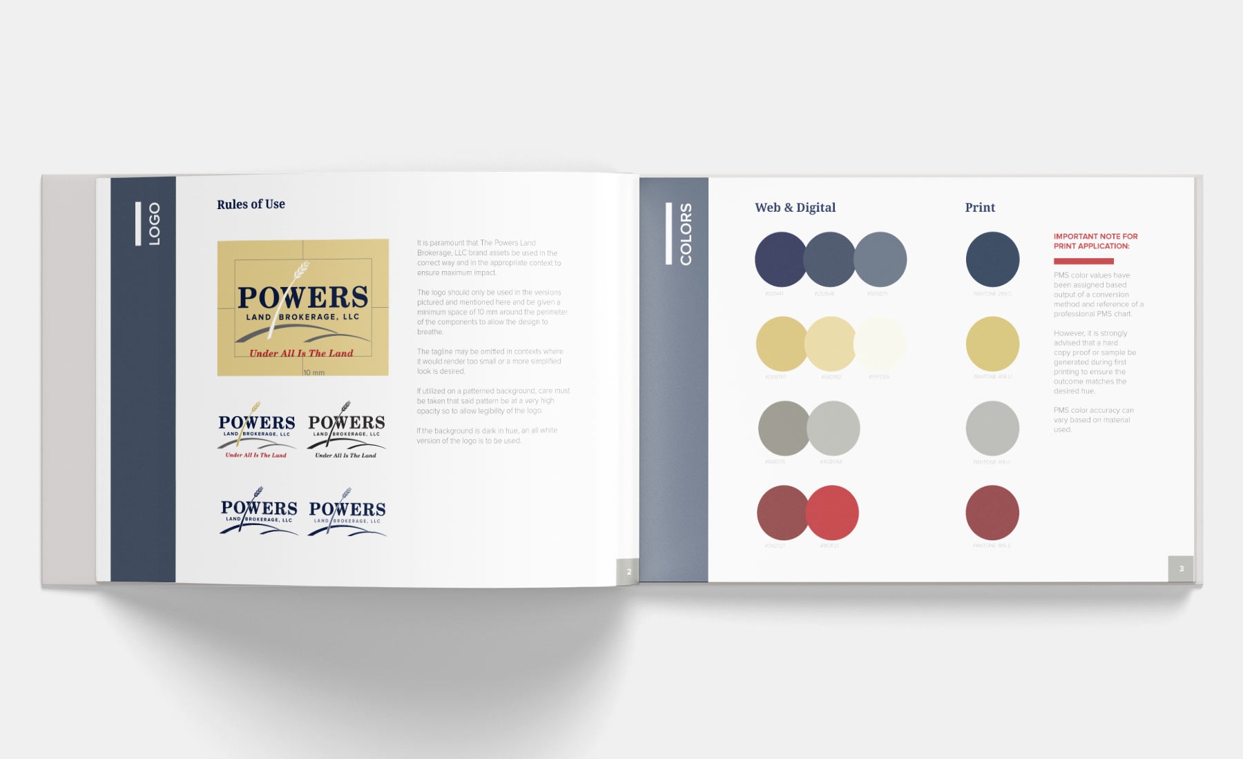
The final visual captures the “golden fields on the open plains of the West” with not just mountains, but also where they meet the plains. This likable, ageless, dependable character was brought into the overall brand system in a single brand guideline.
The next step in the process was to build a custom-designed, responsive website that would be ready to go to work as a critical acquisition tool for the new agency. The site needed to convey the ethos of the firm that is built on a foundation of long standing, conservative values and their many decades of experience with all aspects of land ownership and real estate transactions. Containing up-to-date listings brimming with stunning property photography, the new site establishes the powerful first connection between this quality agency and its clientele.
